Where to Steal Like a Designer: 19 Web Design Inspiration Sites, Categorized
A categorized field guide to 19 web design inspiration sites — full-site galleries, single-pattern libraries, copy-paste component kits, color and icon tools, animation libraries, and AI design tooling — with screenshots of each.
Every developer who has to ship a frontend eventually hits the same wall: the code works, but the page looks like a default Bootstrap template from 2014. The usual advice — “go look at Dribbble” — is only half useful, because design inspiration sites aren’t interchangeable. Some show you concept art that never shipped. Some show you real products. Some hand you working code. Knowing which kind of site to open for which kind of problem is most of the battle.
I recently went through my bookmarks and sorted 19 inspiration and tooling sites into six categories that map to how a design session actually flows: look at what others did → grab building blocks → pick colors and icons → add motion → augment with AI. Here’s the full tour, with a screenshot of each so you know what you’re walking into.
Two axes worth keeping in mind as you read:
- Real vs. concept — Mobbin, Land-book, and the pattern galleries show shipped work; Dribbble shows ideas, many of which were never built.
- Look vs. take — galleries you study; component libraries you leave with code.
1. Design Inspiration Galleries — Full Pages & Products
When you need overall direction — layout, tone, typography, “what should this kind of site feel like” — start here.
Dribbble
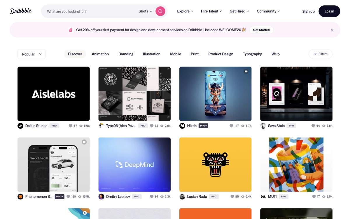
Dribbble’s popular shots is the classic designer portfolio community. The important caveat: most of what you see is concept work, polished for the thumbnail and often never shipped. That makes it great for visual style, color trends, and typography ideas — and unreliable for real-world UX patterns. Treat it as a mood board, not a spec.
Land-book
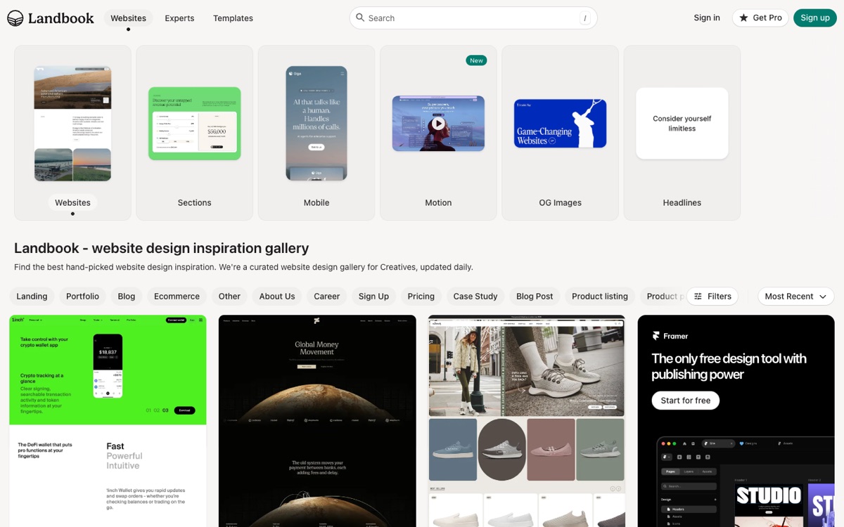
Land-book is a curated gallery of real, live landing pages and websites, filterable by style and industry. Because everything is in production, it answers a question Dribbble can’t: “what do good marketing sites actually look like when real companies ship them?”
Mobbin
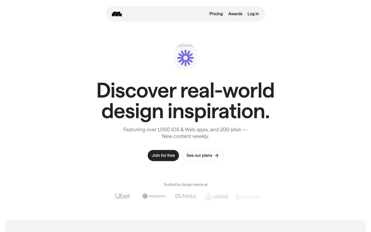
Mobbin is a massive library of screenshots and complete UX flows from shipped iOS, Android, and web apps. It’s the go-to for studying how successful products handle onboarding, checkout, settings, and empty states — not just how a single screen looks, but how the whole flow hangs together. Design teams at Uber, Meta, and Airbnb use it, which tells you the audience.
Supahero
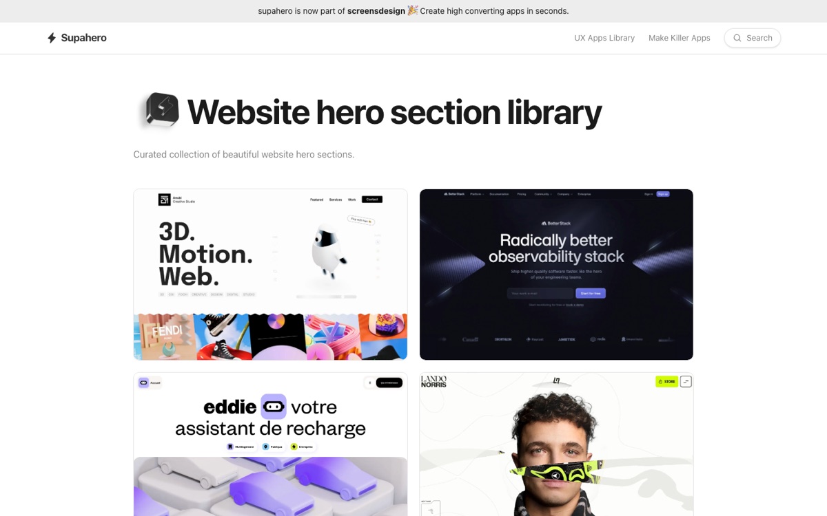
Supahero is a curated collection of hero sections from real websites, now part of the screensdesign.com family. The hero is the highest-stakes section on any landing page, and browsing a few hundred good ones is the fastest way to calibrate what “good” looks like before you design your own.
MotionSites
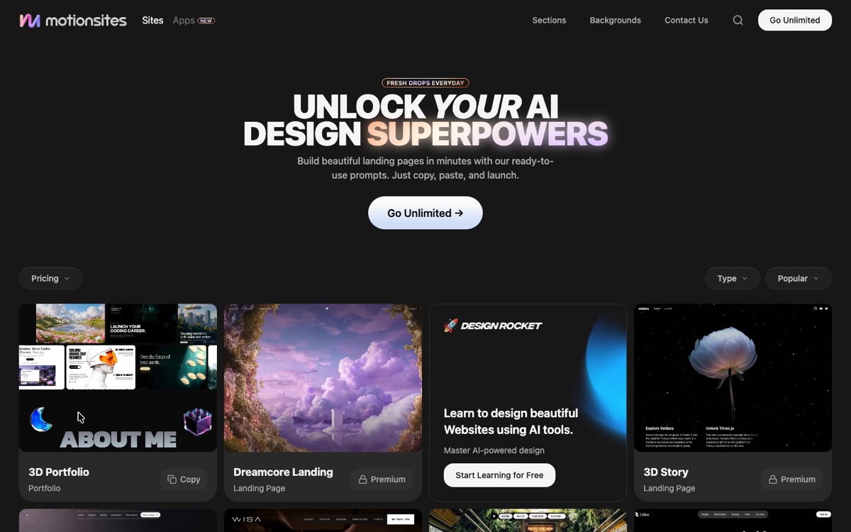
MotionSites is a gallery of motion-heavy, animated website designs and sections. Browse it for animation inspiration — scroll effects, animated heroes, page transitions — with the bonus that many entries are marked freely copyable, so you can walk away with working code for the ones that fit your project.
2. Pattern-Specific Galleries — One UI Element, a Hundred Ways
These micro-galleries each focus on a single component. They shine when you know exactly what you’re designing and want to see the whole solution space at once.
Navbar Gallery
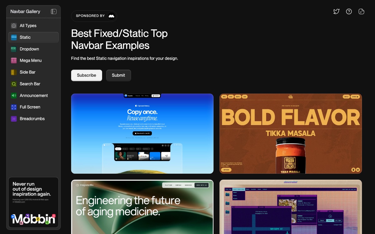
Navbar Gallery collects navigation bars from real sites, filterable by type — static, sticky, and so on. Navigation is the component every visitor touches, and seeing fifty real navbars side by side beats squinting at full-page screenshots.
CTA Gallery
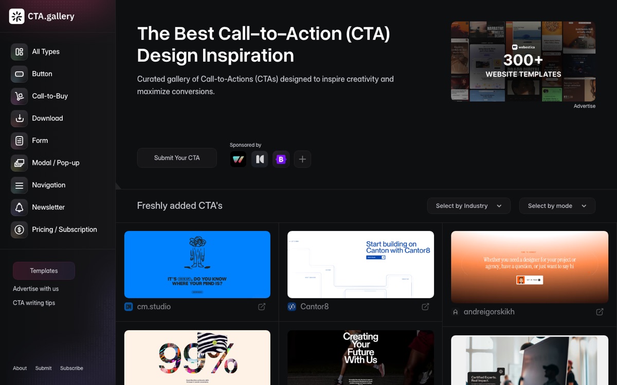
CTA Gallery curates call-to-action sections browsable by industry. It’s conversion-focused inspiration: how do companies actually phrase, place, and style the button they need you to click?
404s.design
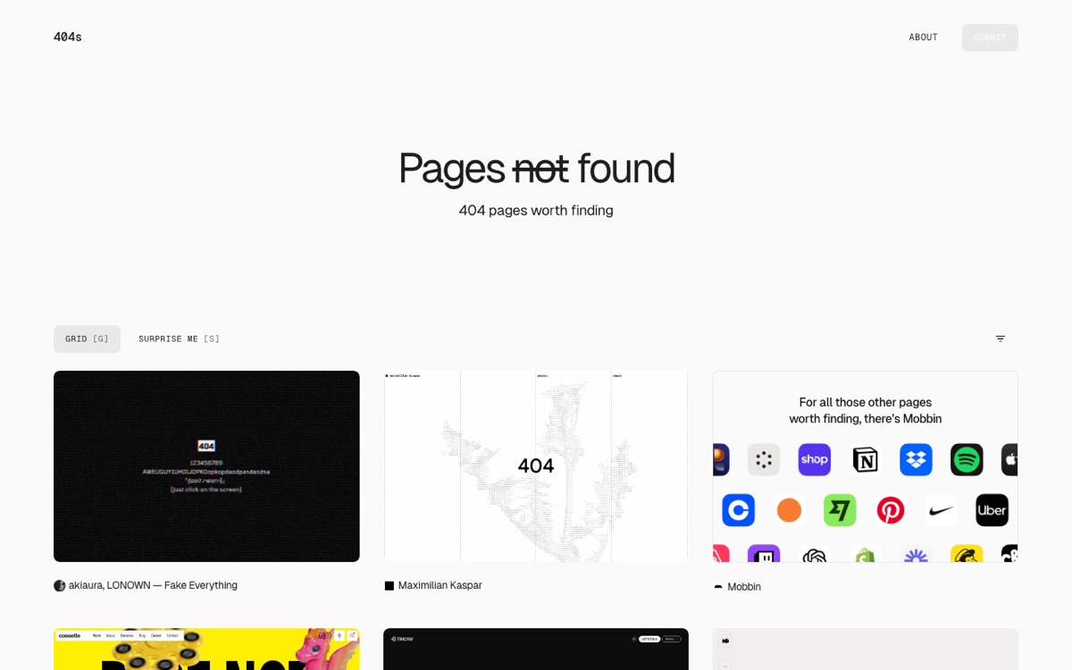
404s.design is exactly what it sounds like: a gallery of creative 404 error pages. It’s the page everyone forgets to design, and also the one place a brand can be playful with zero risk.
Footer.design
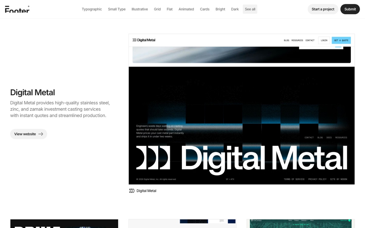
Footer.design does the same for footers. Footers are quietly hard — link hierarchies, legal text, newsletter forms, social icons — and a gallery of good ones saves real time.
Call To Idea
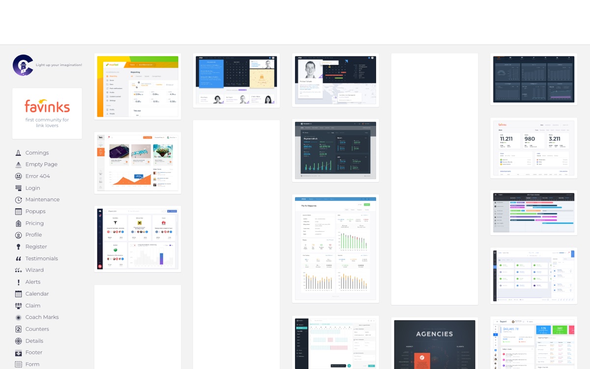
Call To Idea is a long-running pattern library organized by element type — dashboards, logins, sliders, pricing tables, and more. The dashboard section is a solid reference when you’re staring down an admin or analytics UI and don’t know where to start.
3. Ready-Made Components, Themes & Templates — Code You Can Actually Use
Not just inspiration: you leave these sites with working code.
21st.dev
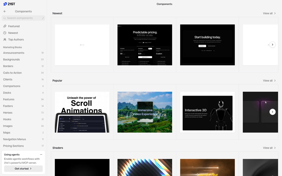
21st.dev is a community marketplace of copy-paste React components in the Tailwind CSS / shadcn/ui idiom — think “npm for UI sections.” Heroes, footers, pricing tables, even shader backgrounds, all published by the community and ready to drop into a project.
HeroUI
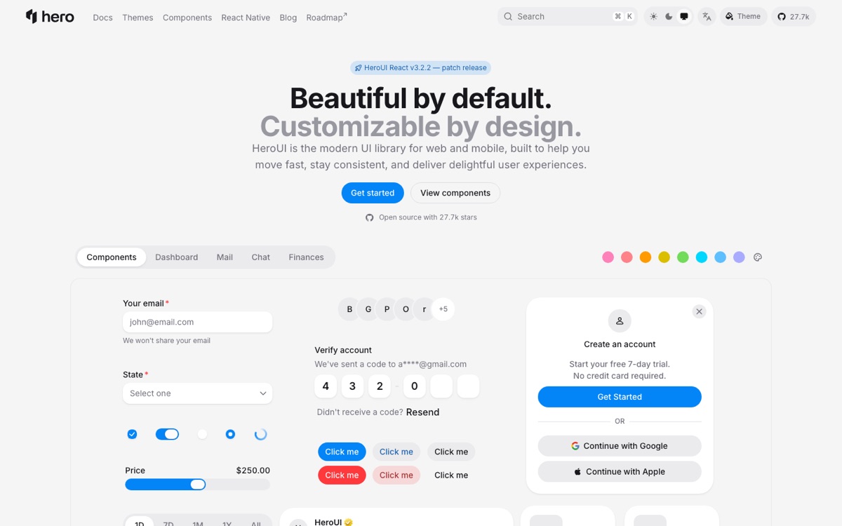
HeroUI (formerly NextUI) is a full open-source React component library built on Tailwind CSS, with polished defaults for buttons, modals, tables, and everything in between. When you need an entire coherent design system rather than one-off sections, this is the category winner.
tweakcn
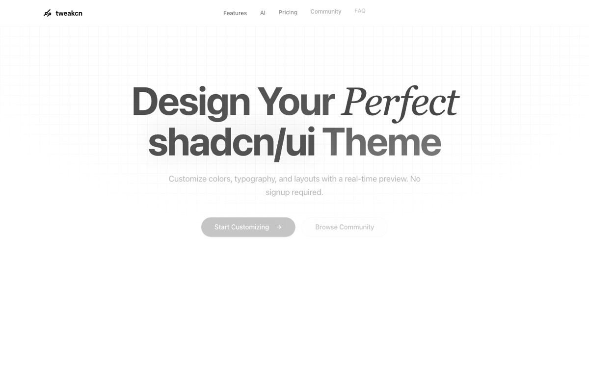
tweakcn is a visual theme editor and generator for shadcn/ui. Tweak colors, radii, and typography against a real-time preview, then export the theme straight into your project — no signup required. If your app currently looks like every other default shadcn install, this is the ten-minute fix.
Coderthemes
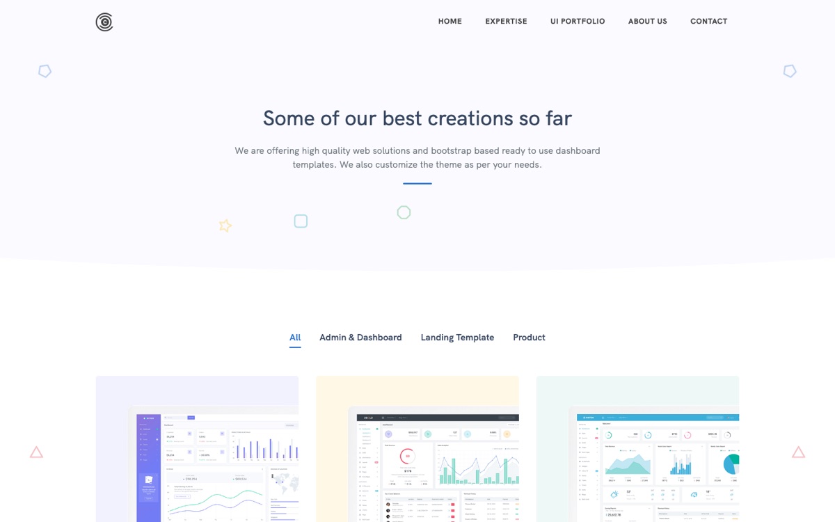
Coderthemes is a template shop selling Bootstrap-based admin dashboards and landing page templates, with customization services on top. Categorize it as “premium templates”: when the goal is shipping an internal dashboard this quarter rather than designing one from scratch, buying a $30 theme is a legitimate move.
4. Design Assets & Utilities
Coolors
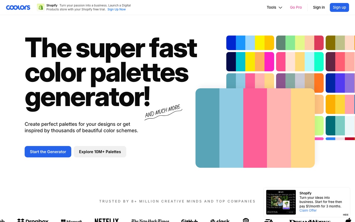
Coolors is the standard first stop for color: a super-fast palette generator that also does contrast checking and palette extraction from images. Hit the spacebar until something clicks, lock the colors you like, and iterate.
IconShelf
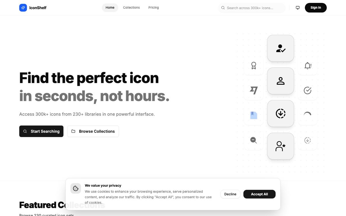
IconShelf is a searchable library of free SVG (Scalable Vector Graphics) icons. Icons are the asset you need twenty of at 4:55 PM, and a good free SVG source with consistent styling earns its bookmark.
5. Animation & Motion Libraries
Inspiration’s cousin: the tools that make the designs you just studied actually move.
GSAP
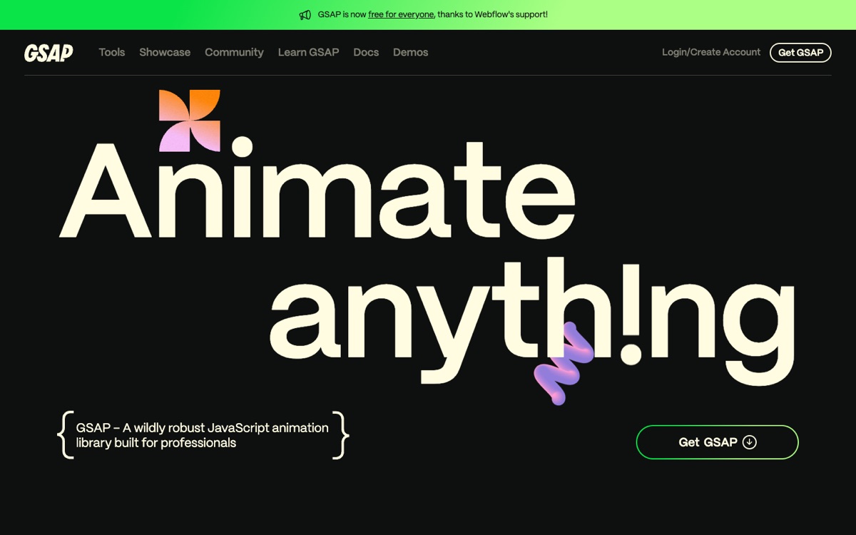
GSAP (GreenSock Animation Platform) is the industry-standard JavaScript animation library — timelines, scroll-triggered animations, SVG morphing, text effects. It powers a disproportionate share of award-winning marketing sites, and as the banner on their homepage notes, the whole thing is now free for everyone (including the formerly-paid plugins) thanks to Webflow’s sponsorship.
Motion
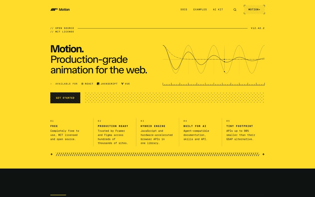
Motion (formerly Framer Motion) is the modern animation library of choice in the React ecosystem, with a hybrid engine that leans on native browser animations for performance. If your stack is React and your animations are UI-level — layout transitions, gestures, presence animations — Motion is the default; reach for GSAP when you need timeline-orchestrated showpieces.
6. AI-Assisted Design
UI UX Pro Max
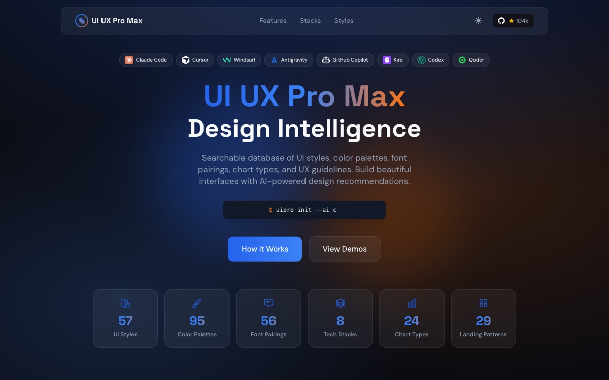
UI UX Pro Max is a different animal from everything above: it’s a “design intelligence” skill for Claude Code that injects UI/UX best practices, style systems, and curated palettes into AI coding sessions, so generated frontends come out looking intentional rather than default. It points at where this whole space is heading — instead of browsing galleries yourself, you encode the taste into the tool that writes the code.
Key Takeaways
- Match the site to the question. “What should this feel like?” → full-page galleries. “How do I design this one component?” → pattern galleries. “I need this built by Friday” → component libraries and templates.
- Prefer shipped work for UX decisions. Mobbin, Land-book, and the pattern galleries show designs that survived contact with real users; Dribbble shows ideas that photograph well.
- Don’t design components in a vacuum. Before building a navbar, footer, hero, CTA, or 404 page, spend five minutes in the corresponding gallery — the solution space is smaller and better-explored than you think.
- Steal code, not just looks. 21st.dev, HeroUI, tweakcn, and MotionSites collapse the gap between “I saw a nice design” and “it’s in my repo.”
- Motion is part of design. GSAP and Motion are free; the difference between a static page and a considered one is often a few well-placed transitions.
Resources
| Category | Sites |
|---|---|
| Full-page galleries | Dribbble · Land-book · Mobbin · Supahero · MotionSites |
| Pattern galleries | Navbar Gallery · CTA Gallery · 404s.design · Footer.design · Call To Idea |
| Components & templates | 21st.dev · HeroUI · tweakcn · Coderthemes |
| Assets & utilities | Coolors · IconShelf |
| Animation | GSAP · Motion |
| AI-assisted design | UI UX Pro Max |